Tuesday, September 27, 2022

Special Topics in GIS - M2.1 TIN and DEM

 In exploring and comparing the TIN and DEM data models, I -unsurprisingly perhaps- found DEM more familiar to work with. Based on previous experience in the UWF program and with displaying ecosystem data through my career, I felt like I had a better handle on how the DEM can be manipulated, which tools I had at my disposal, and consistent expectations for what the visual output would be from a given action. Though it is unfortunate that a DEM requires multiple calculations and tool runs to return values for aspect, slope, and elevation, I already had a solid foundation for this process. The neighbor-dependent nature of derived DEM values like this does produce a model that is easy to read, though less accurate than the TIN.

That being said, working with the TIN dataset for this project was extremely smooth, and as a researcher I think I prefer the higher accuracy available in the TIN, even if this somewhat sacrifices visual display for contour lines. The multiple faces of the triangle network in the TIN made it very clear when modeling difference values over a three dimensional structure, and I felt it was much quicker to get the necessary values in the TIN for aspect, slope, and elevation than the successive familiar tool running with the DEM. 

Overall, while I would be more likely to use a DEM for a public-facing map or display, I appreciate the data quality advantages of the TIN model. When working with three dimensional elevation data especially, I think it will be my first choice whenever one is available. 

A screenshot of the DEM model, with layers of calculated DEMs visible in the contents pane. TINs do not require these additional calculations to display the same information. 


Wednesday, September 14, 2022

Special Topics in GIS - M1.3 Assessment

The goal of an accuracy assessment is to help determine how reliable data is compared to the "actual" - or as close as can be reasonably determined as the actual. With the standardized techniques in the National Standard for Spatial Data Accuracy (NSSDA), we get a determination of positional accuracy that can be used to quantify how "off" a geospatial dataset is from the actual. With standardized protocols like this the accuracy statements become comparable to one another between datasets, allowing a user to select data that meets their needs for this aspect of data quality.

In the NSSDA protocol, the horizontal or vertical distance between a subset (>=20) of dataset features and the "actual" location of the feature is compared, and the difference between the actual and the dataset coordinates are then squared, summed, averaged with mean, and square-rooted to return the Root Mean Square Error. This error is then multiplied by a standard value that represents the average amount of error in the 95th percentile for horizontal or vertical data. The result is the shortest distance in the dataset that can be "trusted", expressed as an accuracy statement to the 95th percentile. 

For this lab a different aspect of data quality was examined; completeness. If accuracy helps determine if a dataset can be used based on how "trustworthy" it is, then completeness determines if a dataset can be used based on the amount of information it contains. In this lab, the completeness of two street datasets was assessed based on amount of data. The street polylines were overlaid and assessed with a grid. This method highlighted areas where the county-provided shapefile contained more lines (reds) and areas where the US Census' Topologically Integrated Geographic Encoding and Referencing (TIGER) dataset contained more lines (blues).

Red areas where the Jackson County file contained more road and blue areas where the TIGER dataset contained more road.


Wednesday, September 7, 2022

Special Topics in GIS - M1.2 Standards


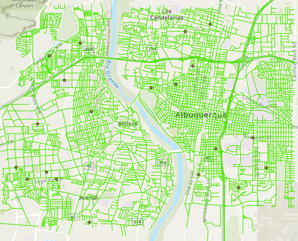
Reference points representing the "true" location of intersections.

As previously discussed, to determine accuracy a datapoint must be compared to a known reference point for what the "true" value is. In this project the goal was to compare the accuracy of two polyline street datasets; one from the City of Albuquerque, and one from the company StreetMap USA. The reference points were determined by using raster satellite images of the roads and neighborhoods contained in both polyline datasets. I selected 20 reference points at intersections throughout the sample area based on guidelines in the Positional Accuracy Handbook. After that I created point datasets that corresponded with the location of those same intersections in each of the street polyline sets. From here, each of the street datasets could be compared with the "true" location of the intersection. I imported the coordinate values into Excel to run the RMSE, and determine the NSSDA for horizontal accuracy of each street dataset. 

Horizontal positional accuracy: 

Using the National Standard for Spatial Data Accuracy, the City data set tested 24.8 feet horizontal accuracy at 95% confidence level.

Using the same National Standard for Spatial Data Accuracy, the StreetMap USA data set tested 278.1 feet horizontal accuracy at 95% confidence level.

Wednesday, August 31, 2022

Special Topics in GIS - M1.1 Fundementals

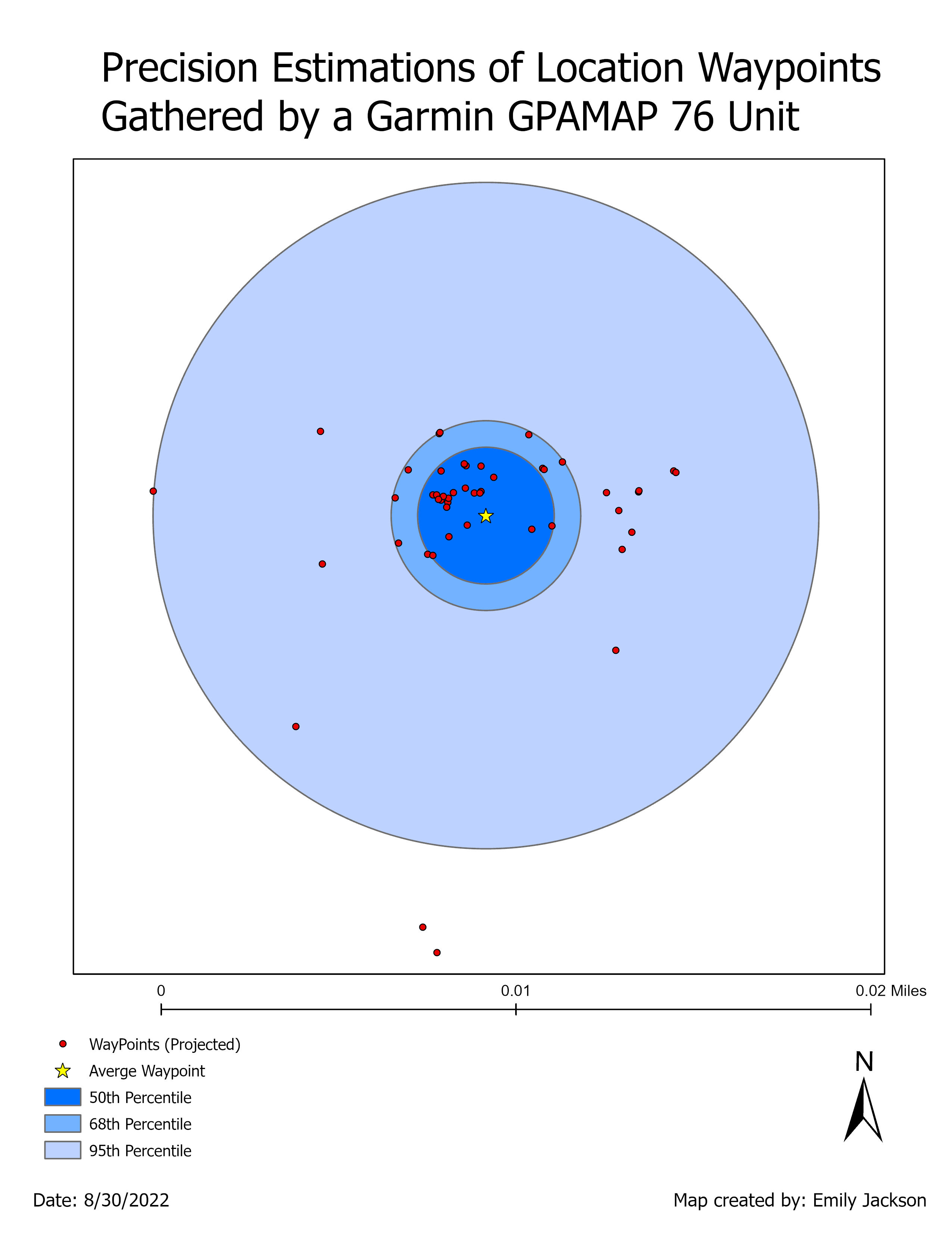
The precision of waypoints mapped by the Garmin GPSMap 76. Blue buffers denote 50th, 68th, and 95th percentiles, the star is the calculated mean waypoint location. 

A primary tenant of mapping and analyzing data well is the ability to assess whether you are working with good data in the first place. For the first lab in Special Topics, we reviewed the fundamentals of data accuracy and precision, particularly in regard to the horizontal and vertical attributes often associated with GIS location data.

The dataset we worked with was 50 points taken several years ago around a single location by a Garmin GPSMap 76. Through basic geospatial and statistical analysis I determined the horizontal and vertical accuracy and precision for the dataset. A subset of those determinations are below:

Horizontal accuracy: 3.49 meters                        Horizontal precision: 4.3 meters

Horizontal accuracy is determined by comparing the waypoints to a known reference point. This is effectively a measurement of how far "off" from the actual xy point the mapping unit was recording locations. Horizontal precision however is a measurement of the range of values returned by the unit, and does not require the "actual" xy point because it is a comparison of waypoints to one another. To determine precision in this case I calculated an average xy coordinate from the waypoint data, then compared how far away from that mean each of the other waypoints were. 

Friday, August 12, 2022

Applications in GIS - M6 Suitability Analysis

Suitability analysis for development in the Applegate. More suitable areas are ranked higher (green), and less suitable areas are ranked lower (red).

In the first section of this lab, we learned the principles of combining several reclassified rasters with the Cost Distance, Cost Path, and Corridor tools to determine suitability and least-cost paths. 

For this development scenario we were given rasters for landcover, elevation, and soil types as well as shapefiles for roads and rivers, then asked to help a developer determine sites for potential development based on suitability. The hypothetical developer preferred certain soil types that were good for building and wanted to be close to roads but further from rivers and wetlands, as well as avoid construction on steep slopes. 

The first step was using the Euclidean distance tool to create rasters of the rivers and roads where cell values would be representative of the distance to those features. This would allow them to be reclassified later with areas further from rivers ranked higher, and far from road access ranked low. I also used the Slope tool on the elevation digital elevation model, so that cells in the new elevation-related raster were representative of the land slope, rather than height. 

With 5 comparable rasters, I ran the Reclassify tool on each with a scale of 1-5, ranking desirable factors like grassland landcover high and undesirable factors like sandy soil low. Once all the rasters were reclassified I used the Weighted Overlay tool to combine them, first with all suitability rasters having an equal weighting, then again with slope having a higher weighting and distance to roads and streams having less weighting. This makes some sense for development, as the trade-offs of being closer to a river or further from main roads are more easily addressed than the trade-offs for trying to build on steep slopes. 

With the weighting adjusted more land was available as suitable for development, particularly land in the valley area, closer to rivers and streams. 

Applications in GIS - M6 Corridor Analysis


Final corridor analysis map from this lab determined with several habitat inputs.

In this lab students were asked to take on the role of park rangers and determine the corridors likely to be utilized by black bears moving between two sections of the Coronado National Forest. We were provided with layers for landcover and elevation, as well as shapefiles of the roads and forest boundaries. 

For my analysis I first checked that all raster datasets were in meters, then used the Euclidean Distance tool to convert the roads shapefile to a raster where cell values were distance to the road. From here I had three comparable rasters for analysis. 

I used the Reclassify tool on the roads, elevation, and landcover rasters to convert their values to ranks from 1-10 on how attractive the cell would be to black bears. Cells close to roads were ranked low, while in landcover any cell values that indicated forest and vegetation ranked high and human development ranked low. Since the assignment indicated black bears prefer mid-elevations, elevation values between 1200 and 2000 meters were ranked high and elevation values below and far above that ranked lower. 

With these three rasters all reclassified, I could now combine them with the Weighted Overlay tool. This tool combines raster values based on an optional weighting, and in this case landcover was weighted higher than elevation and road proximity. The resulting raster had cells containing values 1 to 9, with 1 being least suitable bear habitat and values closer to 10 being most suitable bear habitat.

Suitability raster, green values are those more suitable for black bears.

Unfortunately the Corridor tool uses a cost surface, not a suitability surface, so the sutability raster had to be "inverted" to a cost raster, using the Minus tool. By subtracting the raster from 10, all low ranking places became high cost cells, and previously suitable cells now displayed as low cost. 

Cost raster, inverted from the suitability rankings, darker red areas are higher cost, the forest shapefiles are drawn in light green. 

To conduct a corridor analysis between the two forest areas, I used the Cost Distance tool with this new cost surface raster, once with the northern Coronado section as the source, and once with the southern Coronado section as the source. This resulted in two rasters that displayed the cost over distance emanating from each forest section. Backlink was not important for this corridor analysis, so it was not included. I combined both of these cost distance rasters into one by running the Corridor tool, which automatically determines the least-cost corridor based on two cost rasters. 

Corridor raster displaying the least-cost corridors between the two forest shapefiles.

I explored the corridor raster and found the minimum cost value, then multiplied that value by 1.03, 1.05, and 1.10 and compared results before finally selecting the 5% corridor as my final wildlife corridor. This seemed the best balance between connectivity and space allocation, and I adjusted the symbology accordingly. 


Friday, August 5, 2022

Applications in GIS - M5 Damage Assessment

 One of the most important steps in natural disaster response is the damage assessment; this analysis allows responders to scale the resources needed to assist and is the first step in getting a return from insurance and rebuilding aid allocated. 

The track of hurricane Sandy as it approached New Jersey, the icon color signifies storm intensity with red being Category 2 and green being Post-Tropical

When Hurricane Sandy hit the east coast of the US in October 2012, it came with high winds and a 9-foot storm surge that was augmented with waves and high tide in coastal areas. The assessment that followed was completed by FEMA contracting agencies, USGS, NOAA, and third parties. In this lab, we simulated a scenario, acting as one of those analysts to determine structural damage in the wake of hurricane Sandy storm surge. 

Mosaic files with imagery showing the New Jersey coast both before and after the storm

After creating hurricane track maps for context and developing a civilian self-reporting damage assessment in Survey 123, I loaded pre and post storm rasters into ArcPro as mosaic datasets, and used Swipe and Flicker mode to toggle between them. 

For the analysis, it was important to have constrained values - this means there were a limited number of acceptable values in the damage assessment, and helps standardize the way the damage is classified. To do this, I created the four domains Inundation, Structure Damage, Wind Damage, and Structure Type. The two damage domains were floats and had codes of 0 = No damage, 1 = Affected, 2 = Minor Damage, 3 = Major Damage, 4 = Destroyed. Inundation was a binary 0  = No, 1 = yes option, and Structure Type included the four values Residential, Government, Industrial, and Unknown. 

With these Attribute Domains created, I added a feature class to the Map with the same Damage, Inundation, and Structure Type fields. Once the layer was added, I was able to set the domains as the constrained attribute domains I had created in the Data Design dialogue. This successfully created a point feature class where the attributes could be selected from among the damage classes I created. 

The constrained fields that allow limited selection of attributes during structural assessment

At this point, by zooming into the mosaic imagery and examining property parcels, I used the Create Feature ability to add points to each structure; selecting as they were added whether that structure appeared to have structural damage, wind damage, or inundation, and classifying the structure type as the point was placed. This analysis was somewhat challenging; determining whether a building suffered minor or major damage based only on aerial imagery felt like a very subjective analysis. Additional data like vegetation surveys and elevation overlay would have helped make this more comprehensive.

Results of the damage assessment, with symbology indicating the degree of damage.

With a full set of categorized points providing structural damage assessment, I then added a polyline feature class and delineated the coastline. This allowed further analysis with the Buffer tool for how far different impacted structures were from the coastline. 

Overall, structures closer to the coast were more likely to be destroyed or have major damage, while structures further from the coast had a greater diversity of storm impacts.  


GIS Portfolio

 As a final assignment at the end of my time with University of West Florida, I have built a GIS portfolio StoryMap. The final product is em...